I know layers from Corel; however, layer masks are new to me. You know how you can have something on the tip of your tongue? That's how it is with layer masks for me: they're right there on the tip of my knowledge pool. On the edge, just dipping their feet in. I'm hoping 1 or 2 more YouTube tutorials will shove those masks right in with a splash.
That being said, I did nothing fancy with my photos from Monday. But I like how they turned out.
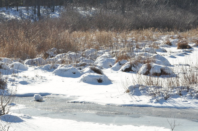
Picture #1:
A reminder of what the SOOC looked like:
I went a little overboard in my first edit, but I still think it looks kinda cool:
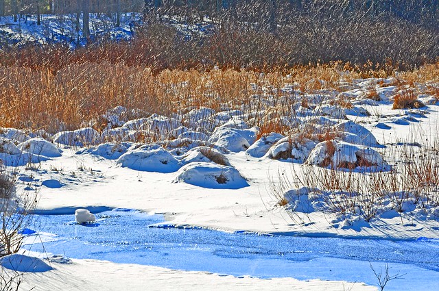
I increased the saturation (obviously!). And then I created a layer to which I added a blue hue. I placed that layer under the first layer and then erased the little stream so the blue would show through. I realize that is opposite what you are supposed to do in PSE where you use a mask and paint on black or white, but I did it the Corel way. I'll learn, I know I will.
This next edit is more subtle, and I like it better:
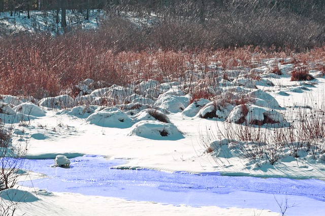
I did the same thing, just not with such intensity.
Picture #2:
The SOOC:
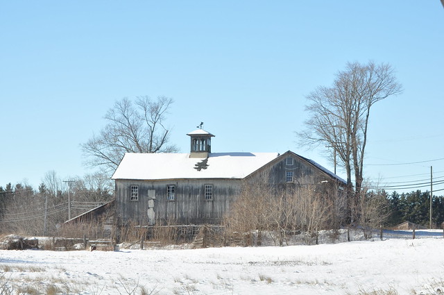
I did several different edits with this one because it was my favorite of the two (don't worry, I'm only going to share a few!).
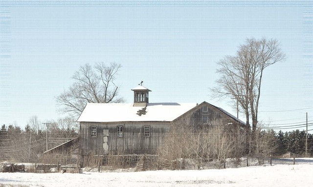
OK...hold on to your hats! With this one, I applied a Coffeeshop Vintage action. I know! I am proud of me for figuring out how to download and install actions too! Of course, it would probably be prudent to learn the basics before jumping to all the fancy stuff, but, in the words of my oldest daughter, "That is just the way I roll."
So anyway, I applied the action and then I also applied a PSE texture, Old Photograph, maybe? Something like that.
Here's the second edit:
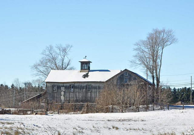
Nothing fancy with this one: just intensified the color and balanced a few things.
And the last. Sort of.
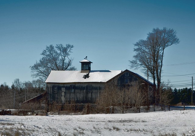
For this one, I used the Guided Editing feature in PSE9 and I performed the Style Match.
I said "sort of" before because this last one is the same exact photo, just framed.
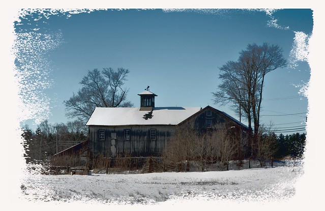
I actually used layer masks for this one, though I couldn't even begin to tell you how to duplicate it. I did it step-by-step while watching a tutorial on layer masks. And, through the tutorial's host, I picked up a bunch of free frames!
So that is it. Maybe next week I'll have the knowledge to be fancy. OR I'll just use some of Ashley's wonderful tips to edit. I probably should have waited on these to edit them using her tutorial, but I was too impatient to play!

23 comments:
I'm really loving what you've done - to be honest, I learned a lot by working with actions. Once I figured out what they were doing, I could apply the lesson to other things. It's EXACTLY how I learned how to use layer masks and I use them all the time now. Let's see...with the first picture, I love your final edit - the subtleness is really nice. Although the saturated image is cool...I just like a more understated approach now. With your second image, I think your second edit is my favorite - again, it's a little more understated but has a really nice balance. Wonderful work this week!
Cool! But I'm such a plebe that I like the SOOC best. :O)
The subtle edit from your first photo is amazing. It looks so natural and bright. :)
great edits. i love what you have done!
Kathleen,
These are great! I really like your old building shoot. I wish someone would write a book filled with "must photograph" old structures!
Great edits, I love them all. Love the old barn!
I'm really loving what you've done with the building....the second edit is my favorite!!!! Thanks for visiting!
Great photos/edits!!! I love that old barn, just gorgeous! xo
Love them all. Love the barn shots-those are my favorite! And great job figuring out how to download and install actions. I've yet to do that!
That barn edit is my favourite and I love how you framed it aswell. It took me a while to get my head around masks but now I use them all of the time.
I love your second edit to the first picture as well! I love how you brought out the colors of the creek! :D
I like your second shot, 4th edit the best. I love the colors and the sky!
so much to learn and I feel so little time.
Love the desaturated edits so that the white and colors aren't screaming out as much.
Ooh! The barn is fantastic!
The second barn is gorgeous!!!
Love it!
Thanks again for joining us!!!!
Blessings,
Jill
http://fnaphotography.blogspot.com
very nice, Kathleen! I think they are all wonderful!
Oh that old barn is beautiful...I like the Coffeeshop vintage one the best. Good for you for experimenting so much! Well done :)
Good job! I wish I had more time for photography. Thank you for checking in with me. I thought I may have lost all my bloggy friends. I need to go back and catch up with your posts. I didn't know you left Atlanta.
Great shots...I love that last one!
Thank you for the links - I am new to PS Elements too! Layers and masks - oh my! :)
Your edits are great!
Your photos are great, Kathleen, and I am in awe! Don't forget to keep blogging about your family, too - of course, photos in that department are always welcome!
You've done a wonderful job with the edits.
Wow! I'm really enjoying your edits! You did a great job on them!
Post a Comment