Ashley's tutorial last week was the biggest a-ha moment I've had in this challenge so far. Although I did not apply to my Up photos the colorizing technique as outlined on the video, I did have fun playing with it. I took this photo (which, incidentally, is a DOWN photo):

I wanted the water to be bluer instead of that nasty brown. Learning the colorizing technique as well as the fact that you can fill the mask with black made it so easy to get blue water:

So the first shot:

Except for a crop, I really like this shot SOOC; however, I wanted to do some creative editing. I did nothing in RAW, just a crop. Then I cloned out some of the extraneous branches that seemed out of place after the crop.
And here was the fun part. I had in my mind that the brown color of the dead flowers would look so nice against more of an aqua background, despite how pretty blue the sky was. Before learning what I learned last week, it would have taken me forever to use the magic wand to select the sky and then adjust the hue. But this week - easy peasy: I created an adjustment layer to adjust the hue, chose blue, and adjusted the hue until I liked the color. I then increased the saturation a bit...and the plant wasn't even affected at all!
Finally, I placed Kim Klassen's chamomile texture and adjusted to overlay blending mode.

Now for my monkeys in a tree:

In RAW, I increased the saturation a tad. Then opened the photo, did a high pass filter on a new layer and adjusted soft light blending mode to 50%.
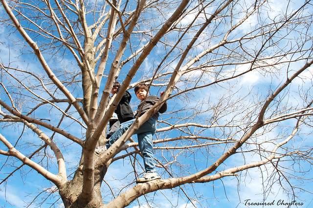
I thought about cropping so the focus would be more on the boys, but I just loved the huge spread of branches against the beautiful, blue sky, so I left it as is.
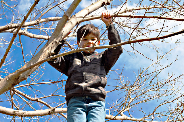
And my lone monkey:

In RAW, I increased the blacks and the saturation just a bit. I then opened the picture and did a high pass filter on a new layer, which I adjusted to pin light blending mode. I then flattened the image, created a new layer and adjusted the sharpness a bit as Jacob was a bit out of focus. Finally, I adjusted the color curves to get rid of some of the shadows on Jacob.
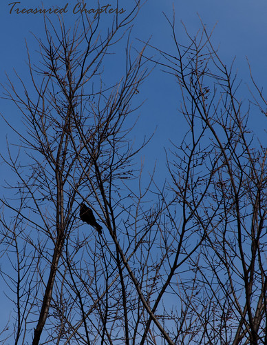
And my crow photo:

In RAW, I cropped and increased the blacks to try to bring out the crow a bit. I then opened the photo and created a new layer. I adjusted this layer to difference blending mode at 50%. I then created another layer and adjusted this to overlay at 100%.
And then my stormy sky photo I pulled from the archives:

I mentioned that I edited this photo once before but wasn't happy with it. I wasn't happy with it because I didn't yet know what I learned last week. This is how my first edit looked:
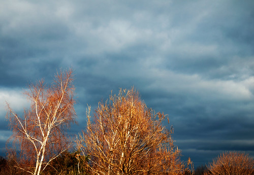
You'll notice how strange and fake the trees look because I wasn't able to isolate any one color which resulted in my actions affecting the entire photo.
With last week's lesson in mind, I did a slight crop to get rid of the top of the house, and in RAW I increased the blacks, the contrast, and the vibrance. I then opened the photo, created a new layer, and adjusted it to overlay. This created a very dramatic stormy sky, but also those terrible trees as in the photo above. So I created an adjustment layer to adjust the hue/saturation. I then decreased the saturation and lightened the reds and yellows to bring the trees back to more normal.

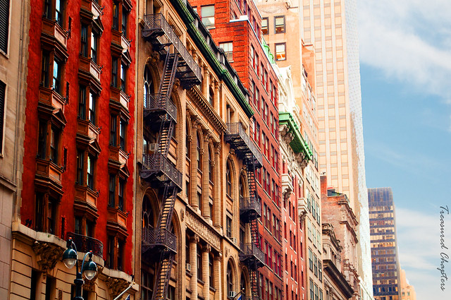
Finally, I want to share with you another sky technique I've used several times, one I learned in my early PSE days through a YouTube video that I couldn't find for you now if you asked me to. But I'll try to explain it here. I know you've seen this picture before, but it was a great one to use for this example.

I took this picture in New York and love the buildings but don't like the sky. It is too gray/white...dull.
Well, that is it. Thanks again to Ashley for a great tutorial last week!

25 comments:
Those ARE "Wow"! I want that software! I want to play! I may have to pull out some coloring books till then... ;O)
Wow! I had no idea that all of that was possible. I only have access to Picnik. I wonder if I'm able to do any of that. I'll have to try and find out using the advanced editing tools.
Wow! Lovely work!!
I'm over here smiling because I'm so proud that it all finally clicked. When you start putting things together and applying them in different ways, wow...what a difference it can make. I love your edits this week. And that last shot is seriously incredible!
Great processing, the hydrangeas are my favorite!
Great edits! Thanks for sharing your technique.
Great job!! I love what you did with the texture shot - beautiful. and my favorite has to be the NYC buildings - so cool how you added the sky!
Wow, you rocked all these! Nicely done!!
Those are definitely all "wow"! I actually like the trees in the sixth edit, the one you thought looked fake? I've seen that in real life just before a storm. Those look great as is. :)
I'm off to try the trick with the sky! thanks for the idea!
These are all amazing...great job!
These are all fantastic! But I love, love, love the second and last edits. GORGEOUS, Kathleen!
Those are great Kathleen. I love how you changed the colour of the water, how you made those trees have their silver back again and how you changed the sky in the last shot. I changed a sky on a photo (which isn't on my blog yet) this week aswell only my technique was completely different. I end up with whitish skies so many times. I must try it your way aswell and see which I prefer.
These are definitely WOW!
Amazing photos and the edits just make them more so. I loved the technique from last week too.
These are all incredible. Your second one is my favorite but I also love your last one. That's really cool what you did with the sky! I'll have to try that sometime.
Beautiful! Really great edits this week!
great edits. love the blossoms on the tree when it was all done. beautiful.
Wow! Very impressive!
Kathleen- I just love how each of those turned out! The crops & exposure adjustments really made everything pop!
These are incredible! I love the aquamarine background of the flowers. Like a different picture. I love how your monkey shots turned out--so much brighter than mine--love them! Wonderful job!
Oh. My. Gosh! The photo you used for your thumbnail in the link up...just wow. I dunno what even to say! You were SO right about the brown in the plant looking great against a turquoise sky! I really do love that creative edit! Great job! The rest are awesome as well!
wow! Look at you go!
Love the blue water -- you did a great job!
But my fav of them all is the storm clouds (2nd to last shot, but the first edit) Love love love!!
Very cool before and after photographs.
I really like your post-processing on of them, but I LOVE the last photograph in New York; the colors you brought out in your post-process are amazing!
awesome edits! i'm with iris - your last NY shot is GORGEOUS! perfection in editing!
Post a Comment